Step by Step PPEC
Healthcare platform designed to help parents understand complex medical services under stress
Context
Role
Product & UX Designer
Timeline
December 2025
Outcome
Scope
Constraints
Bilingual requirement · Parent stress factor · Medical compliance
The Challenge
Parents of medically fragile children needed a website that explained complex pediatric extended care services without adding to their stress.
The site had to balance medical seriousness with warmth, communicate eligibility clearly, and guide overwhelmed parents through the enrollment process, all in both English and Spanish.
Process Overview
Understand
Researched parent pain points when evaluating PPEC facilities. Identified confusion around eligibility, insurance, and what daily care looks like.
Decide
Prioritized eligibility clarity upfront, bilingual parity, and reducing cognitive load. Excluded complex scheduling in favor of tour booking.
Design
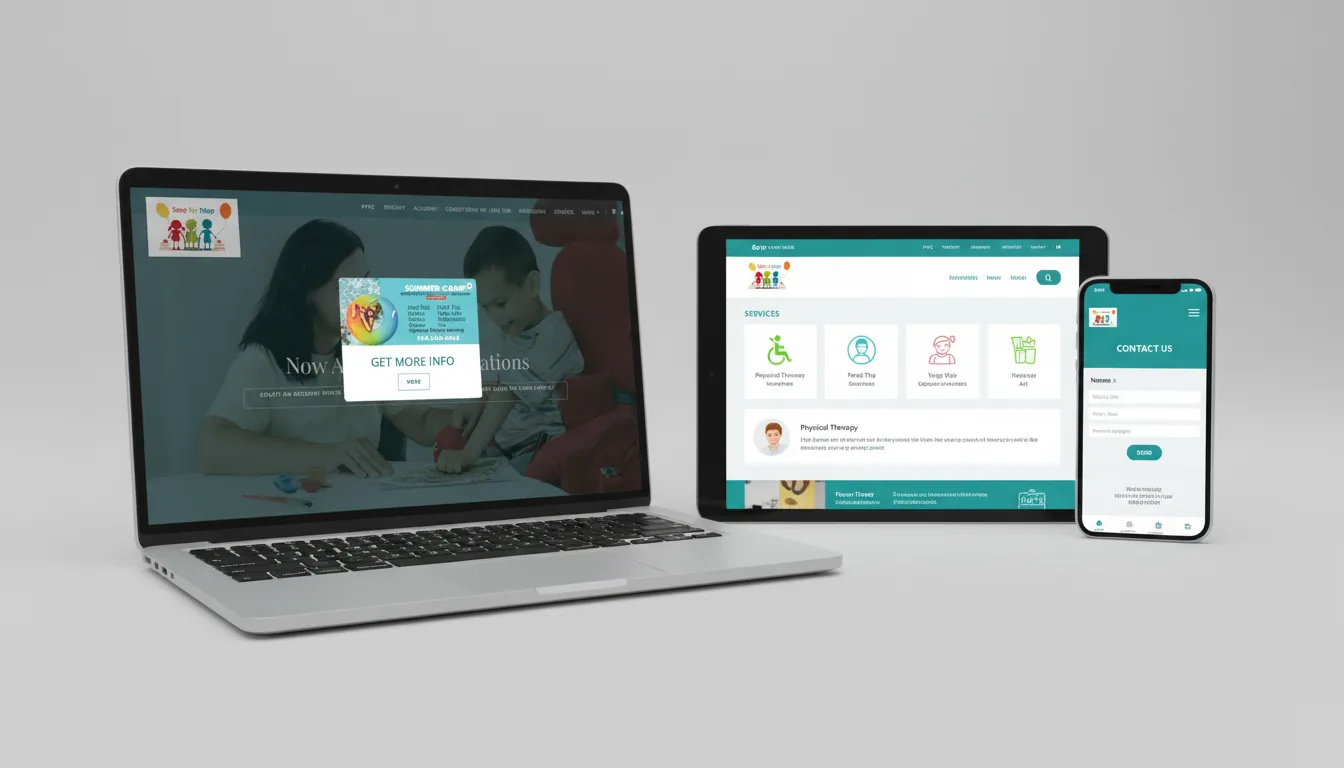
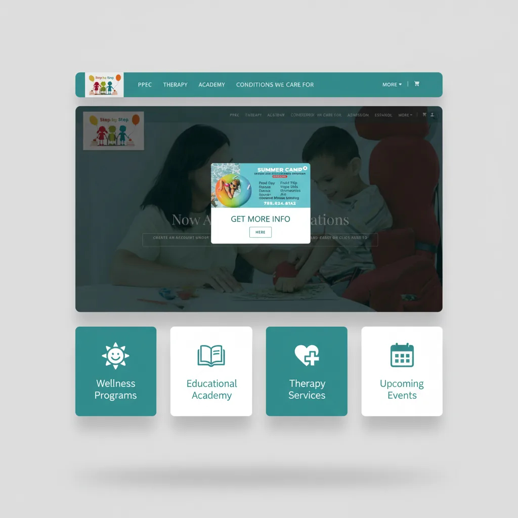
Created clear service breakdowns with icons, warm color palette (teal + coral), and digestible information chunks with visual breathing room.
Deliver
Launched bilingual responsive website with tour scheduling, WhatsApp integration, and video content. Currently live and serving Miami families.
Design Decisions
- →Eligibility decision flow upfront: Parents researching PPEC are often unsure if their child qualifies. A clear 'Is this right for your child?' section answers this immediately.
- →Warm color palette (teal + coral): Healthcare sites often feel cold and clinical. Warm accents balance medical seriousness with the nurturing care environment.
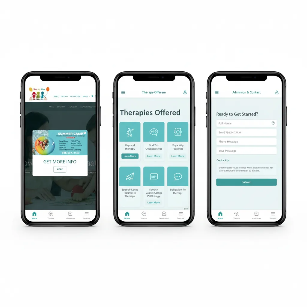
- →Services broken into digestible sections: Complex medical services (nursing, therapies, respiratory care) are explained in plain language with visual icons.
- →Tour scheduling integration: Parents want to see the facility before committing. Embedded scheduling reduces friction in the decision process.
Visual Design
A warm, accessible healthcare interface balancing medical credibility with nurturing care for stressed parents.
Accessibility & UX Considerations
Parents seeking PPEC services are often stressed and overwhelmed. The design prioritizes clarity and ease of use above all else.
High Contrast
Clear text hierarchy and sufficient color contrast for readability under stress.
Plain Language
Complex terminology translated into everyday words users can understand.
Mobile-First
Optimized for users accessing on phones in waiting rooms or on the go.
Reduced Cognitive Load
Information chunked into clear sections with visual breaks to prevent overwhelm.
Outcome
- —Website launched and currently live serving Miami families
- —Full English/Spanish bilingual experience
- —Integrated tour scheduling reduces friction for prospective families
- —WhatsApp integration enables quick parent communication
The client reported increased inquiries and positive feedback from Spanish-speaking families who felt the site 'finally explained things clearly.'
What This Project Demonstrates
- •Healthcare UX with accessibility focus
- •Bilingual design with native-quality experience
- •Complex service simplification for stressed users
- •End-to-end delivery from strategy to launch
- •Mobile-first responsive design
- •Balancing warmth with medical credibility