Santiago's Mortgage · 2026
SANTIAGO'S MORTGAGE
Designing a bilingual conversion site for a direct mortgage lender serving Latino families across the US.

4 funnels
design decisions
brief to delivery
Overview
The challenge wasn't aesthetics, it was trust. Santiago's Mortgage is a direct mortgage lender with 20+ years in market, $89B+ in closed loans and 310+ Latino families served in 2025 alone. Most visitors arrive after being told "no" by traditional banks.
The site needed to lead with empathy and operate as a full system for both the customer and the internal team: from first visit, to pre-approval, to document handoff, to admin review.
Visit live siteThe Core Design Question
How do you turn "the bank said no" into "I want to talk to you" , without ever meeting in person?
Research
Competitor Benchmark
I benchmarked 8 mortgage lender sites serving Latino audiences across the US. Most followed the same shortcuts. Each pattern became a deliberate decision: adopt, reject, or invert.
| Pattern Identified | Frequency | My Decision |
|---|---|---|
| Long-form home page with stacked loan products | 7 of 8 | Rejected. Segmented with tabs (Buyers/Investors). |
| Calculators that hide PMI, HOA, taxes, insurance | 6 of 8 | Rejected. Built honest calculator with all 8 inputs. |
| Pre-approval forms asking name first | 8 of 8 | Inverted. Financial data first, personal data second. |
| Generic stock photography of "happy families" | 5 of 8 | Rejected. Real photo of Santiago + real metrics. |
| No system for document handoff post-submission | 8 of 8 | Adopted as gap. Built upload portal + admin panel. |
| English content "translated to Spanish" | 6 of 8 | Inverted. Wrote Spanish-first, then English equivalent. |
The Process
From Research to Structure
Key Design Decisions
Decision 01
Financial data first, not last.
Pre-approval Flow
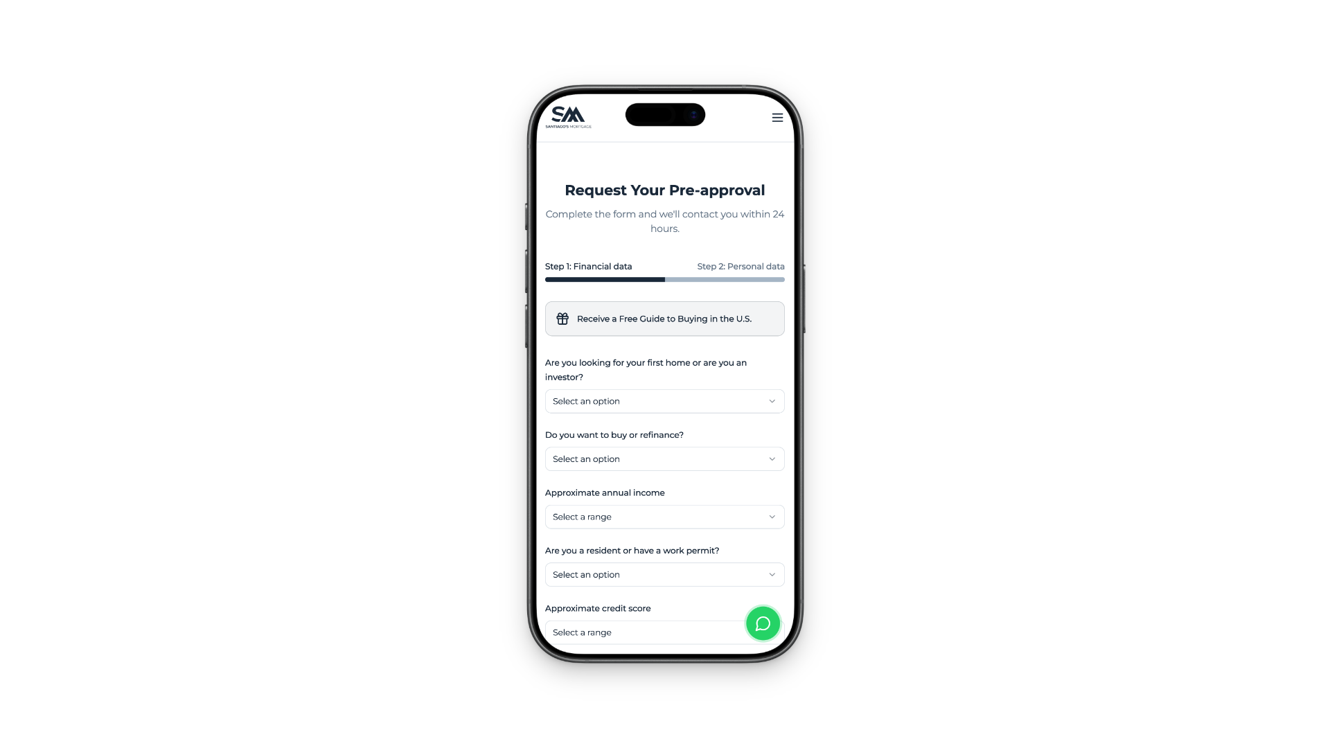
Every competitor asked for name and email before financial data. I inverted the sequence: credit score, income, and debt-to-income ratio come first. The result: only qualified leads reach the contact stage, and Santiago's team spends time on prospects who can actually close.
Decision 02
Auto-segment with tabs, not cards.
Information Architecture
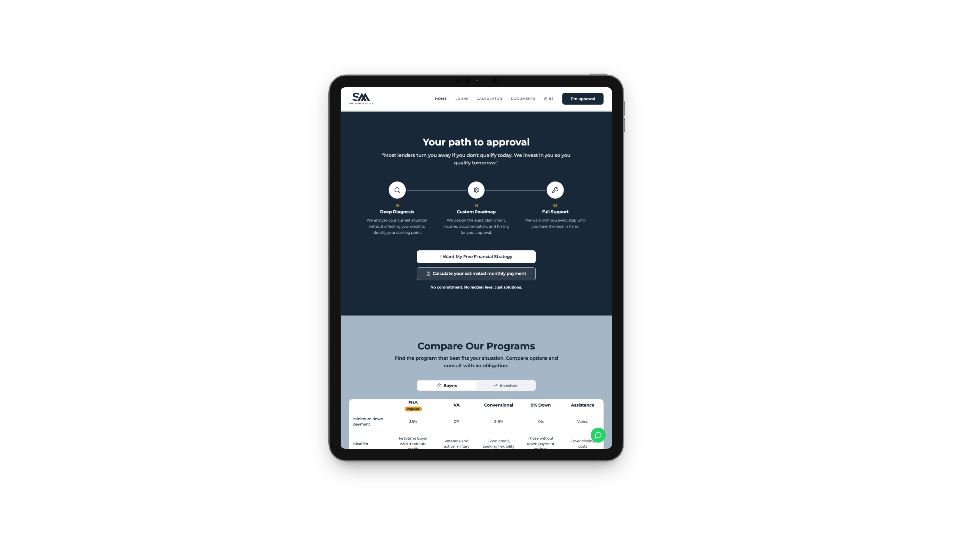
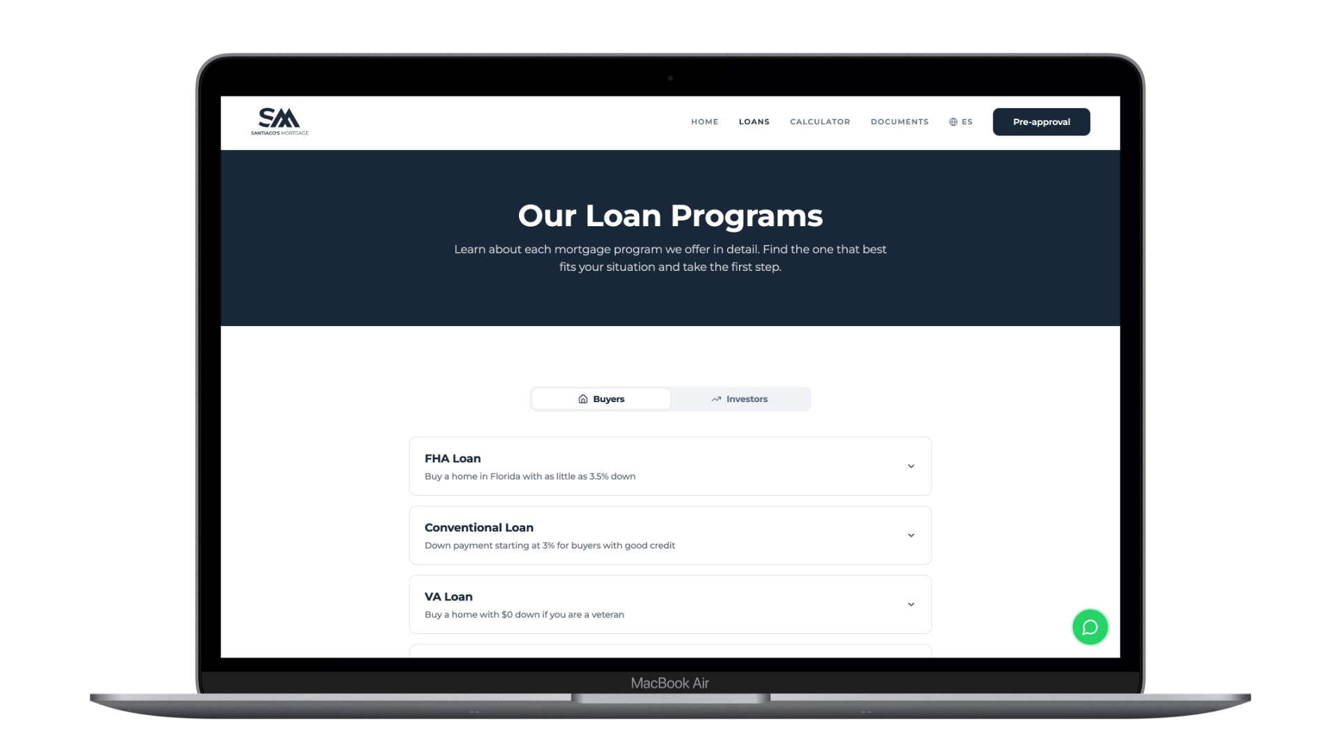
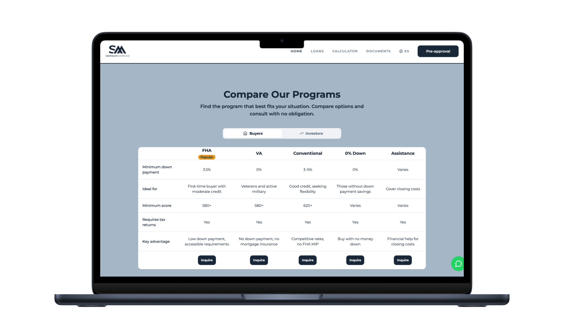
Benchmarked sites dumped all 5+ loan products into a card grid and forced users to read everything. I grouped products by intent: Home Buyers and Real Estate Investors. One click filters the entire page, including the comparison table. Decision time dropped from scanning 5 cards to one tab switch.
Decision 03
Honest calculator as positioning.
Brand + UX
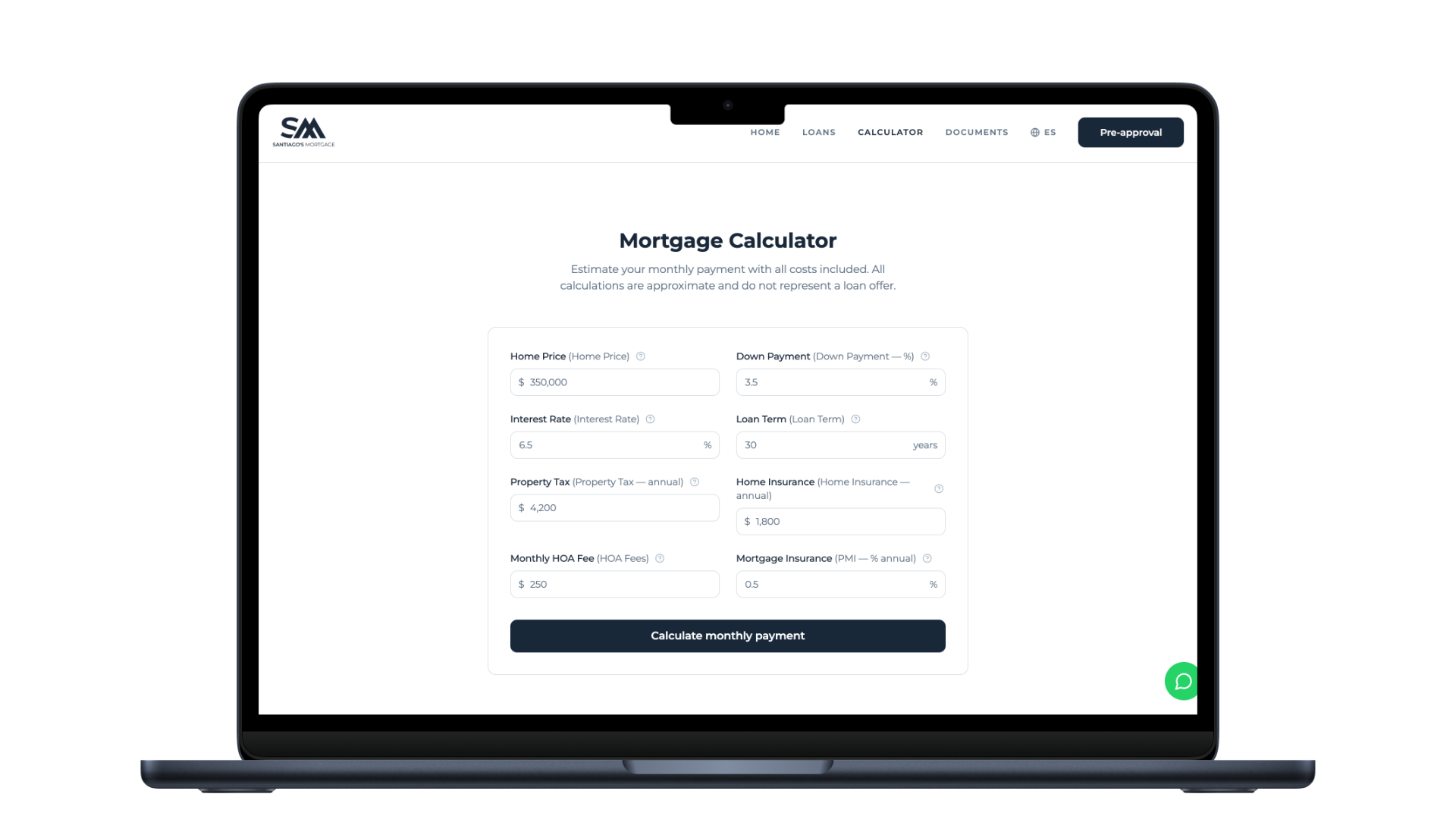
6 of 8 competitors hid PMI, HOA, taxes, or insurance behind small print or secondary screens. I built a calculator that exposes all 8 inputs upfront. The monthly payment shown is the real one. For a Latino audience used to hidden fees from traditional banks, this became a trust signal, not just a tool.
Decision 04
Admin panel as core, not extra.
Operational Design
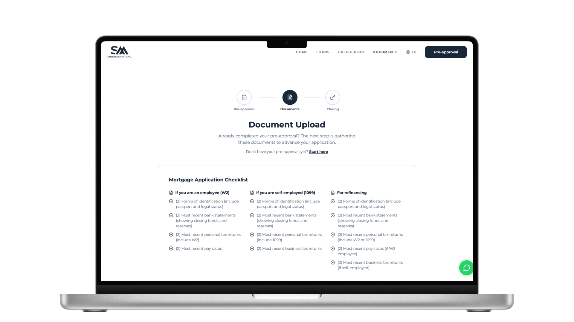
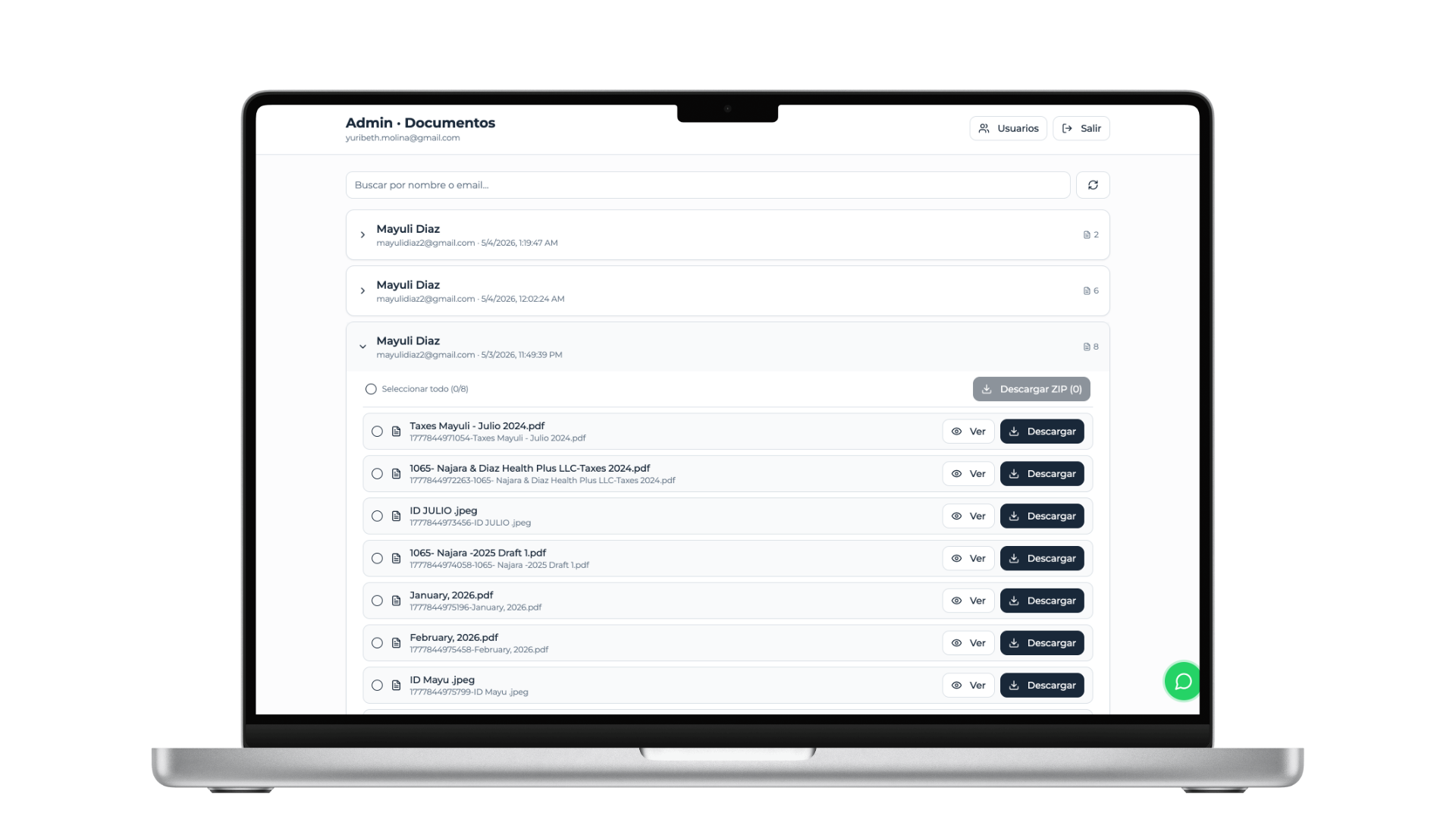
The document handoff was initially scoped as a nice-to-have upload form. I promoted it to a system: customers upload by employment type with a checklist, and the internal team searches, reviews, and batch-downloads from a single admin panel. The bottleneck moved from scattered email threads to a 2-minute workflow.
Decision 05
Spanish-first, not 'translated to Spanish'.
Localization
Most sites write in English and then translate. I wrote the primary flow in Spanish first: tone, legal terminology, and cultural cues were native from the start. The English version is the adaptation. For a market where trust is built in the details, this matters more than a language toggle.
Built for every screen
Mobile-First by Default
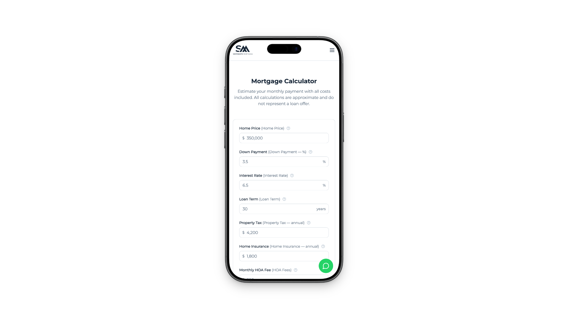
The Latino home-buying audience browses primarily on mobile. Every component, calculator, form and document upload was designed mobile-first, then expanded for tablet and desktop.
Built with AI · Lovable
LovableLovable made it possible to ship a 9-section bilingual site with calculator, pre-approval flow, document portal and admin panel in 3 weeks, without sacrificing custom design or conversion logic.
Speed is the differentiator only when judgment is still the differentiator. AI accelerates the build; the strategy, IA and conversion thinking still have to be earned upstream.
Document System · Customer + Admin
What started as an "extra" component became the highest-impact deliverable. Customers upload by employment type with a clear checklist; the internal team searches, reviews and batch-downloads from a single admin panel. The bottleneck moved from email chains to a system.
Results
Status
Live in production
Pre-approvals
2 since launch
Document uploads
15 since launch
Client status
Delivered
What I Learned
- In trust industries, IA beats visuals. The order of information signals respect, not the polish of the components.
- Benchmarking surfaces patterns that are invisible from the inside. 8 sites, 6 reusable rejections.
- AI builds need strategy upstream. Lovable accelerates the build, not the thinking.
- The real scope is rarely the visible scope. The admin panel was the highest-impact deliverable.